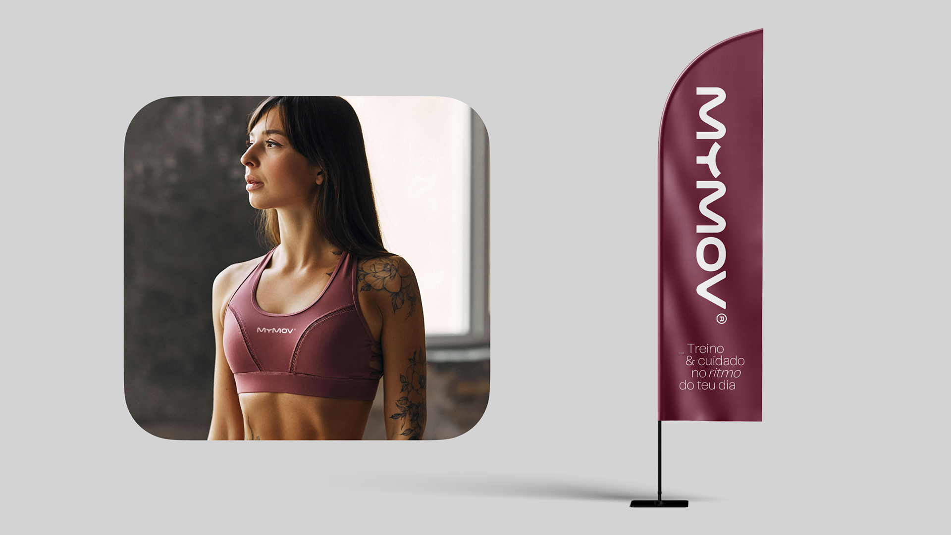
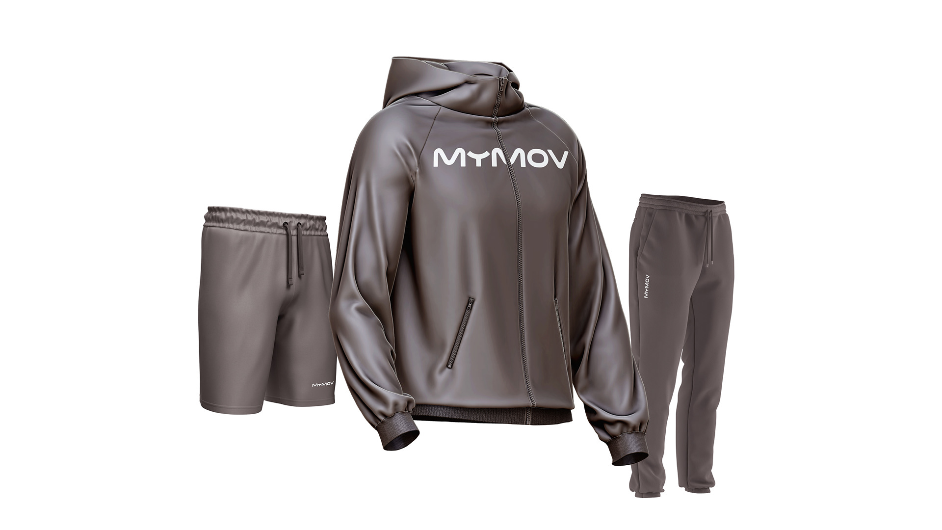
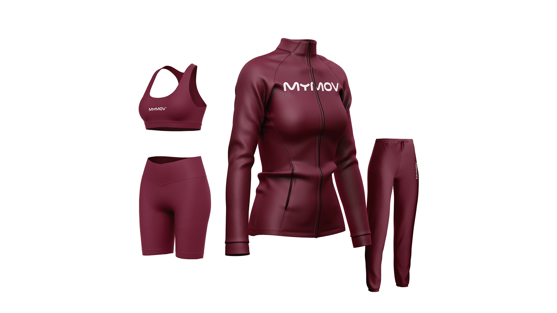
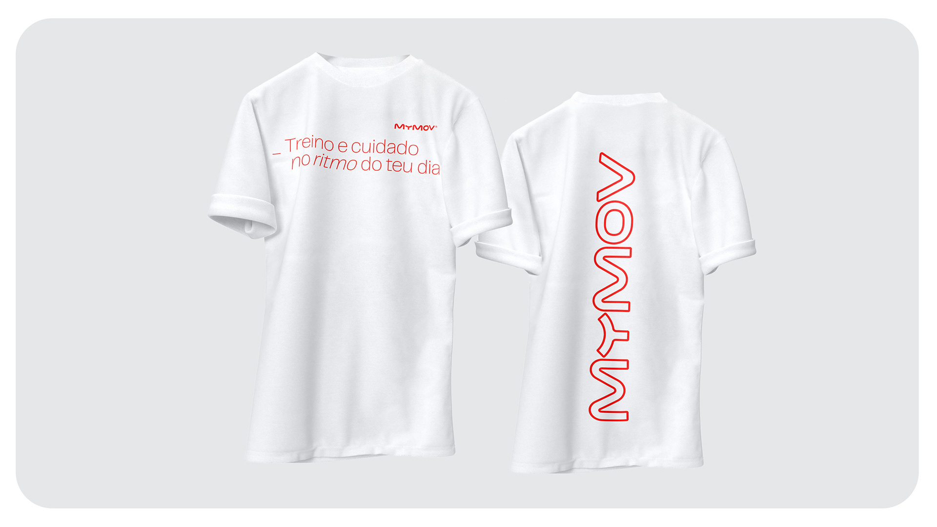
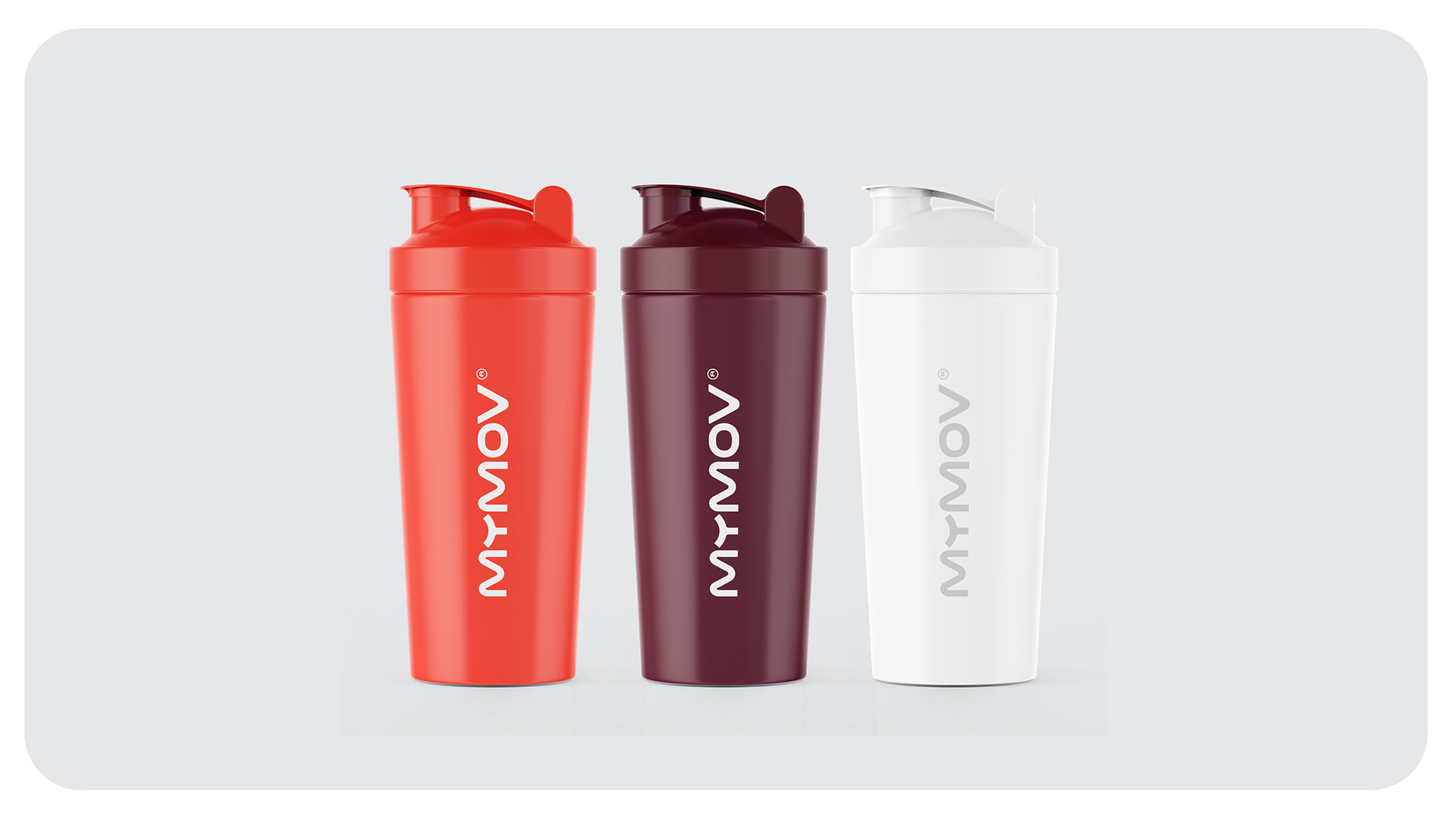
MyMov was created from the ground up as a fitness and wellbeing platform that connects personal trainers with people looking for guidance that fits naturally into real life. From the naming to the complete visual identity, the brand was shaped around movement, flexibility, human support and meaningful progress, making training feel less imposed and more personal.
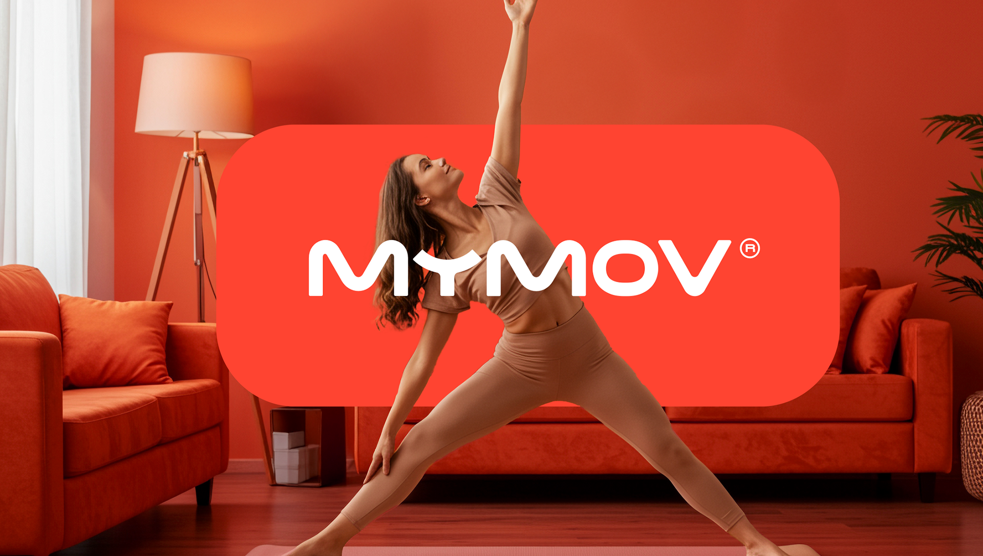
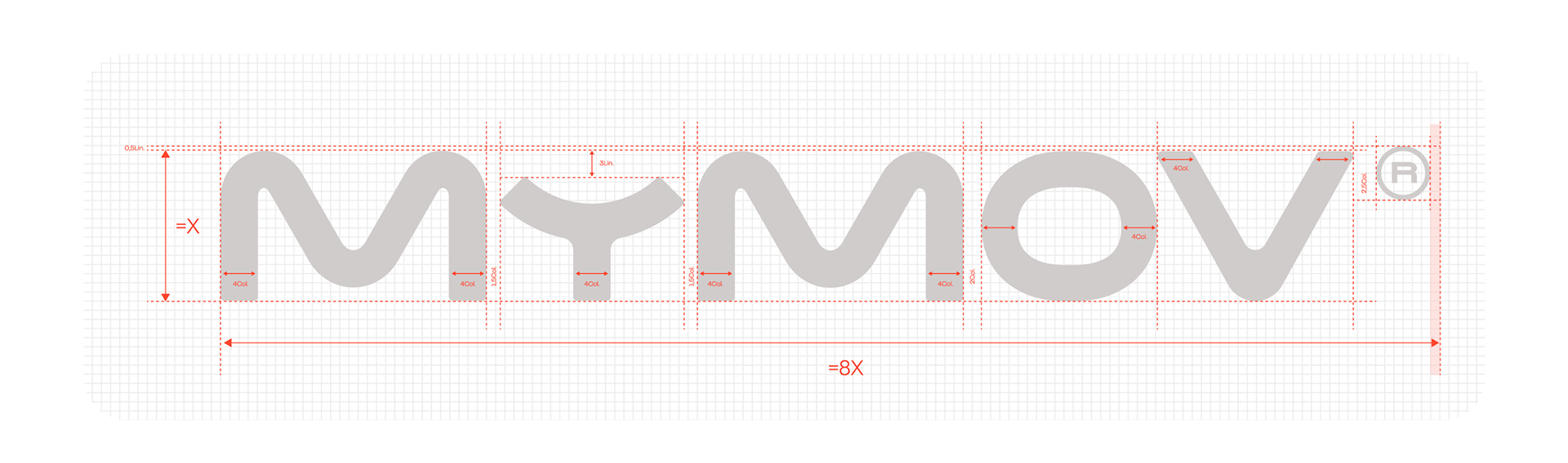
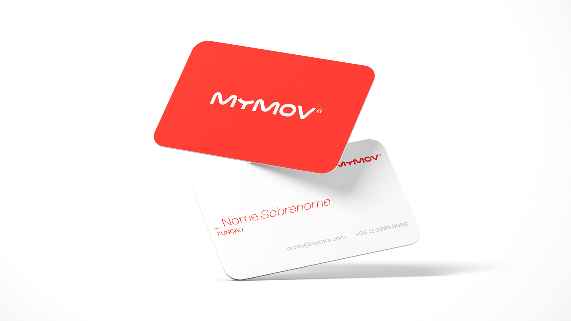
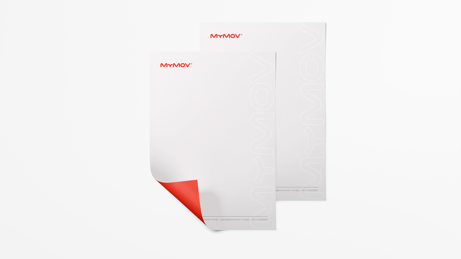
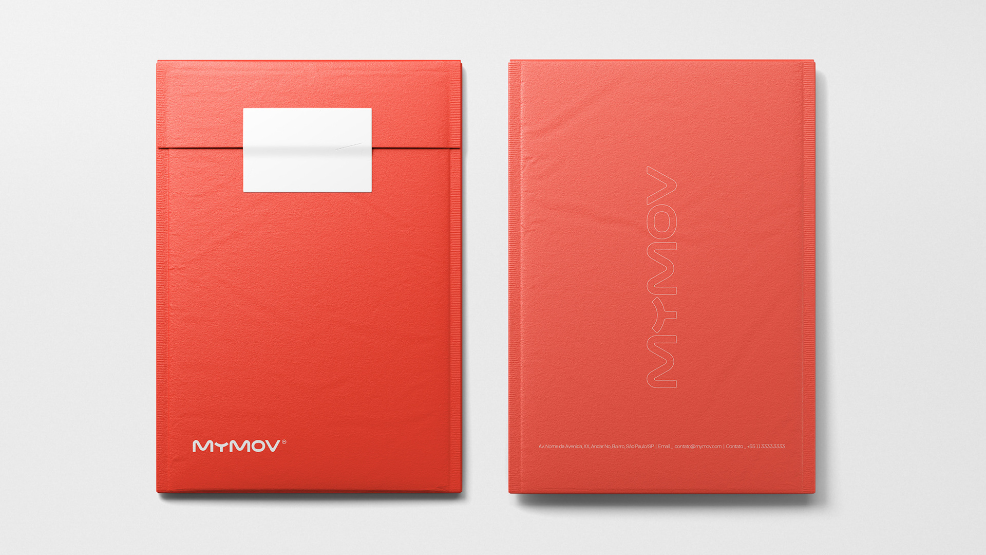
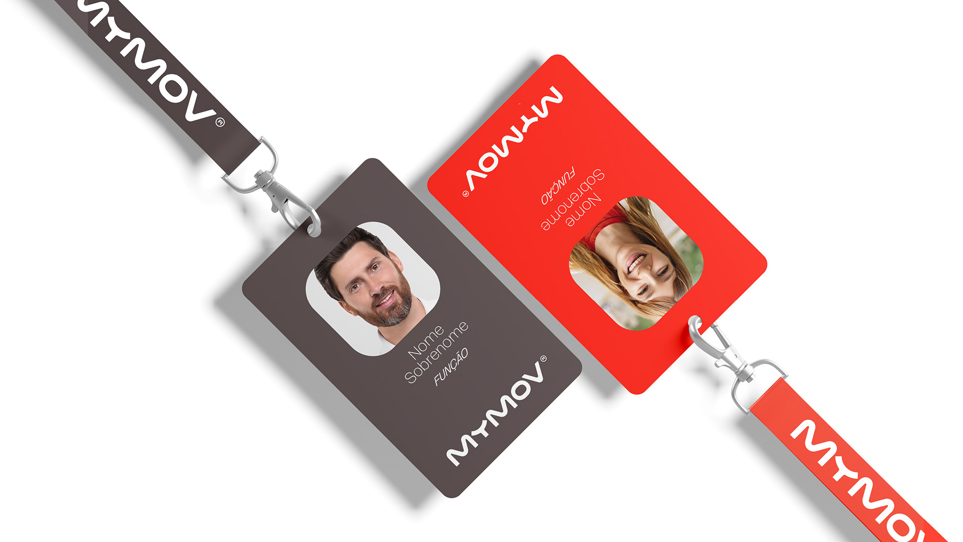
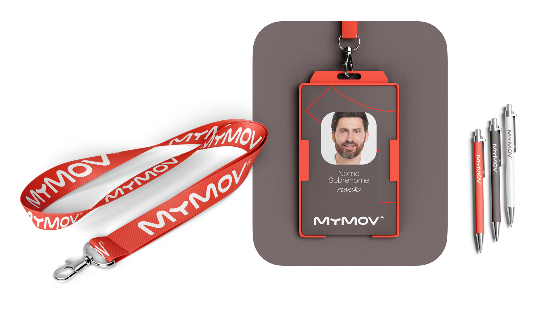
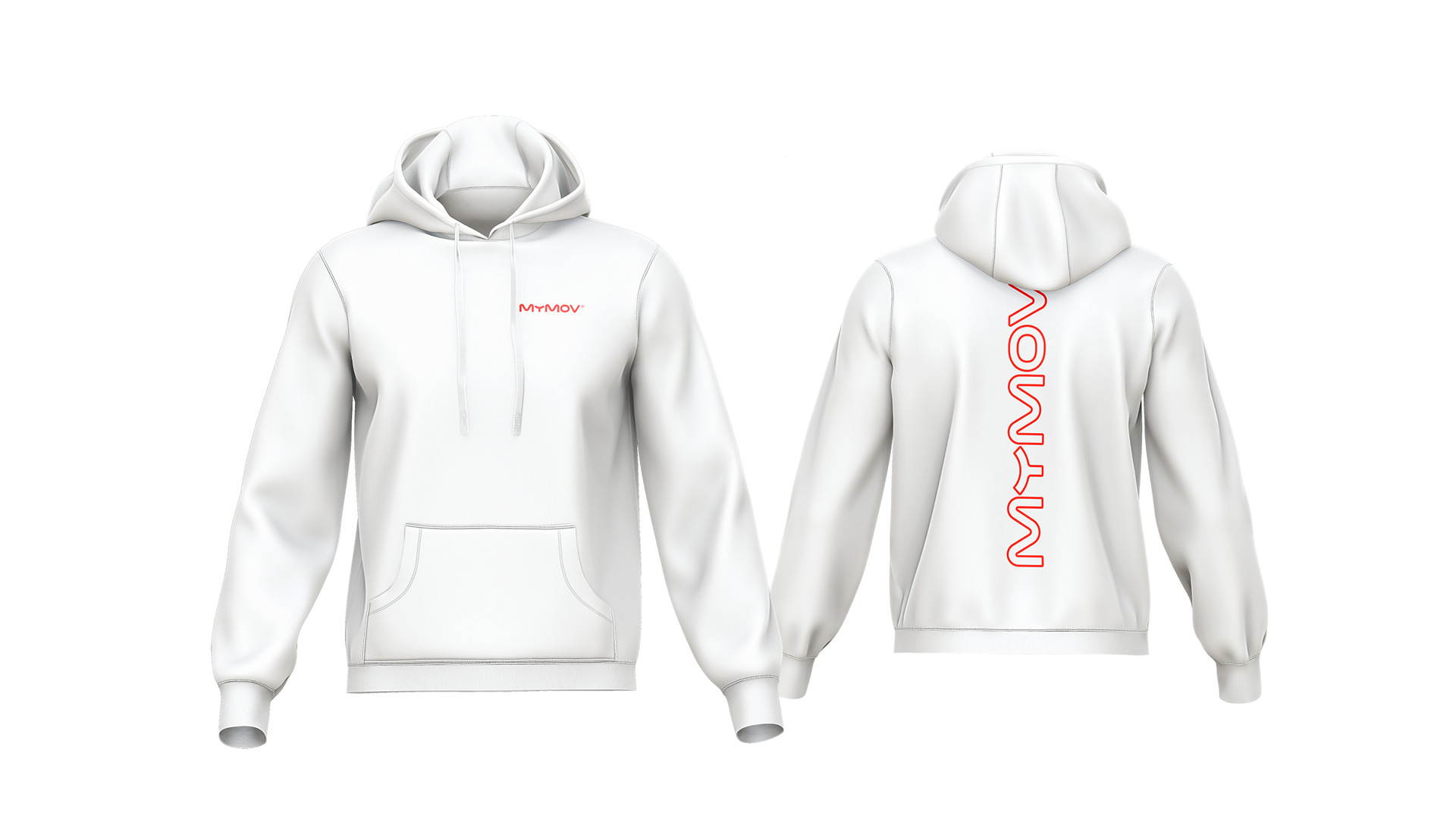
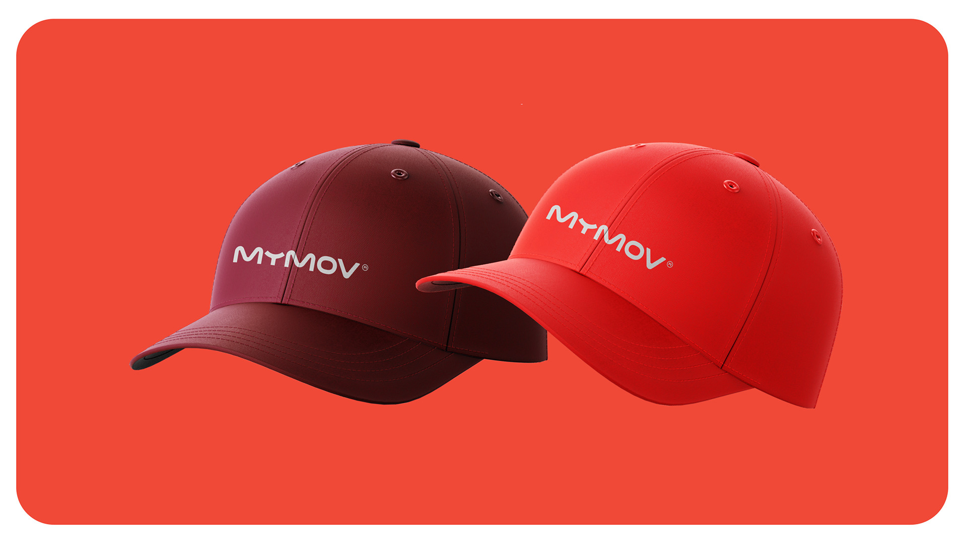
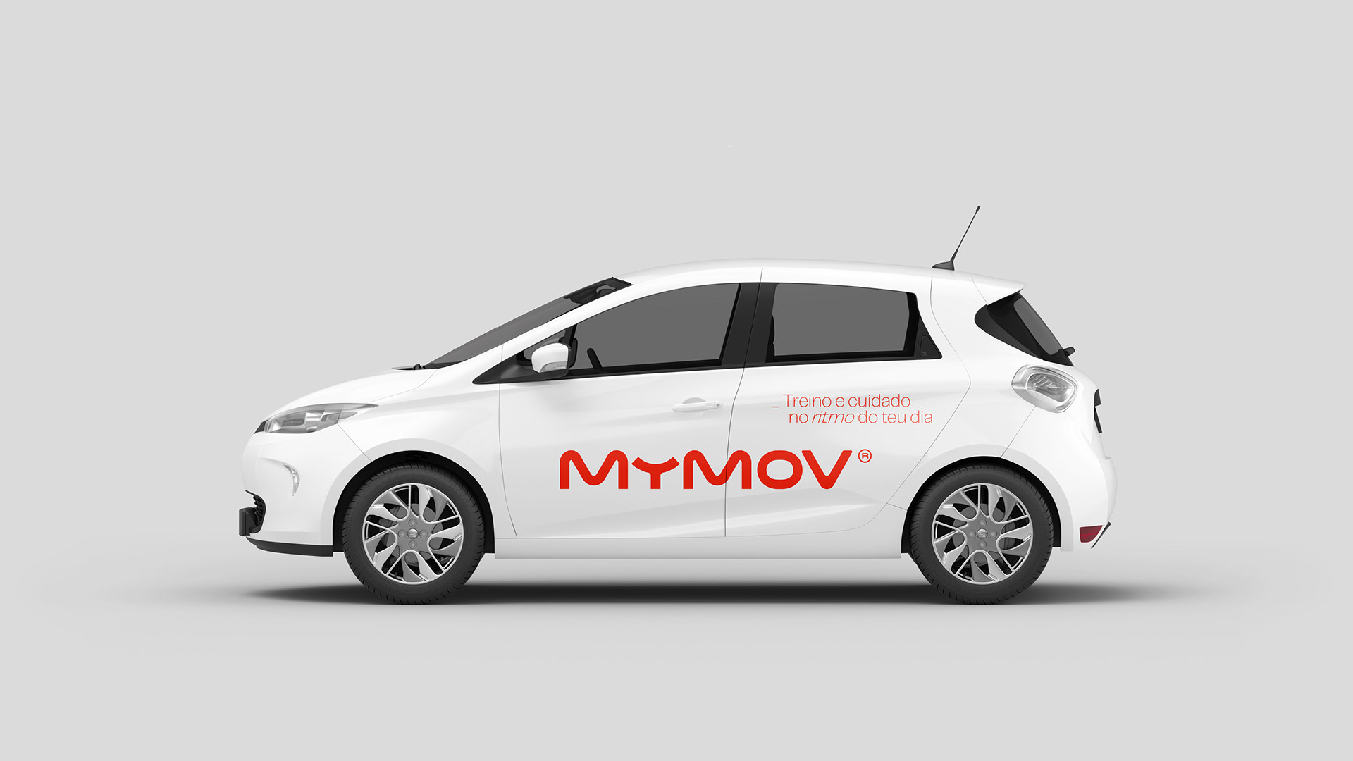
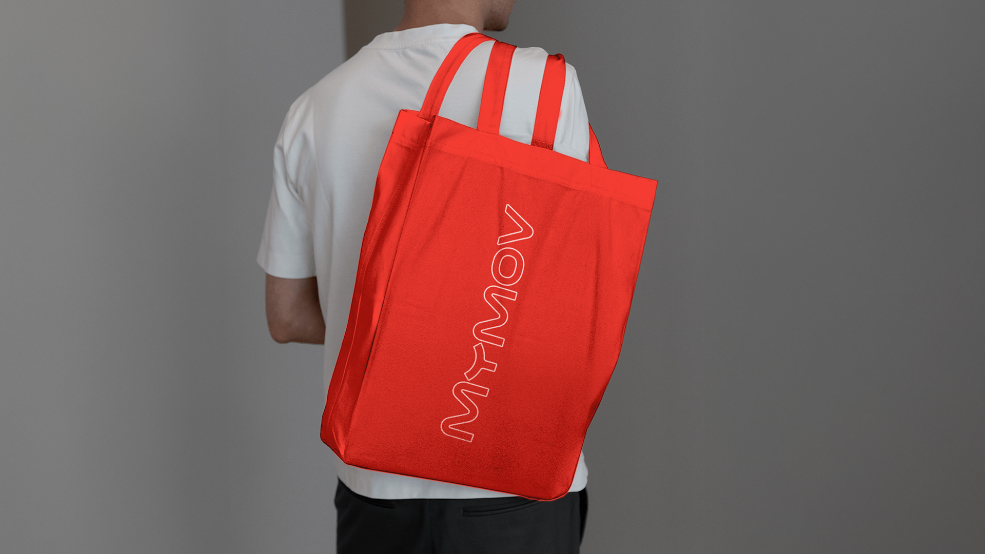
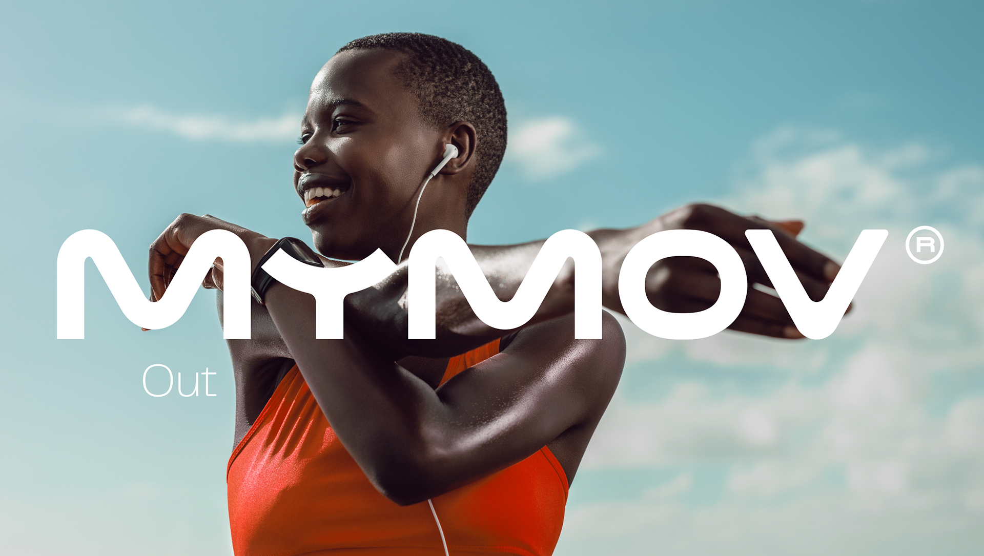
Every letter of the MyMov wordmark was custom-drawn, giving the brand a distinctive and ownable character. Its fluid, elastic construction creates a continuous visual gesture that stretches, embraces and connects, representing movement, adaptability, human connection and evolution.
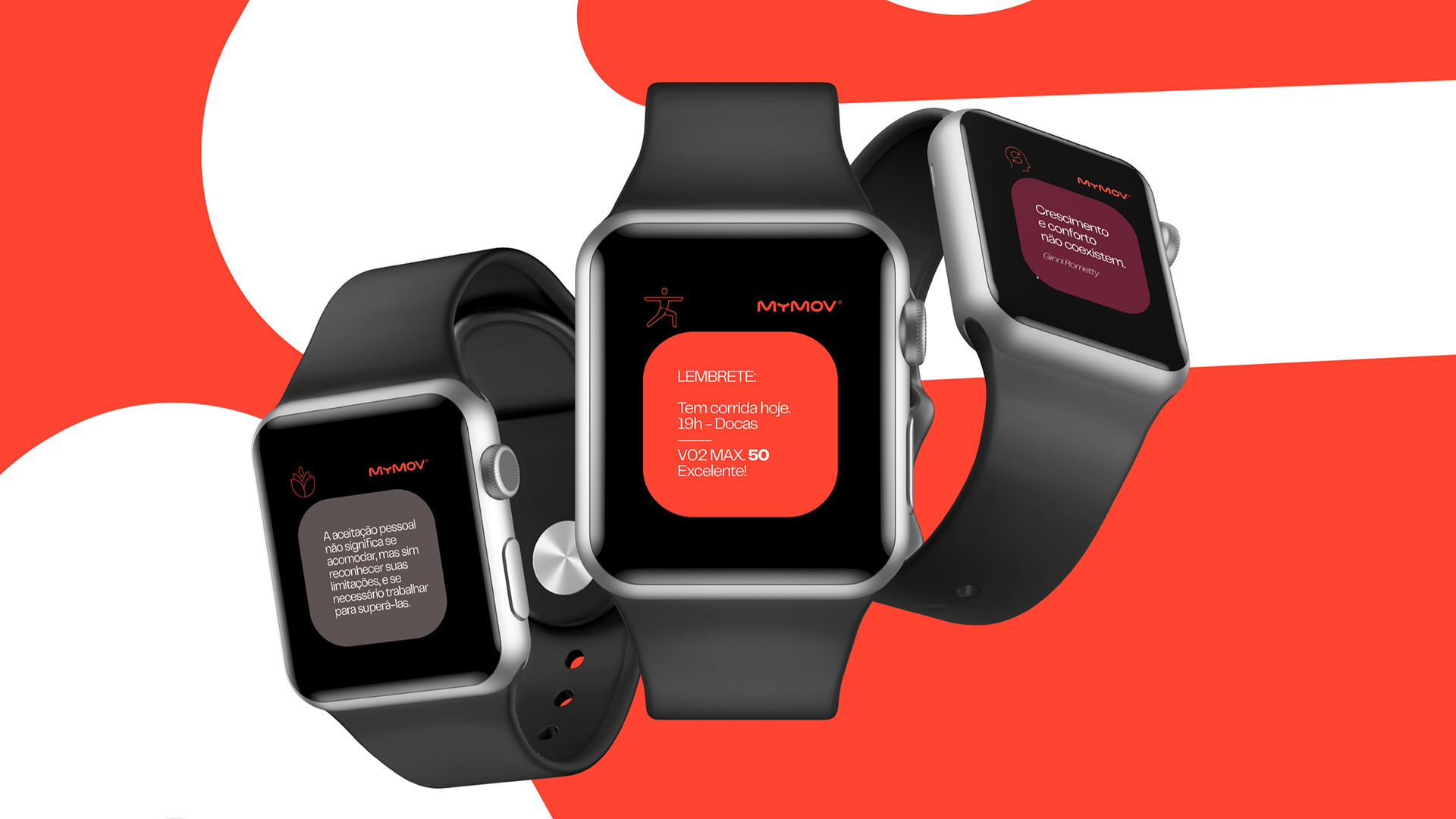
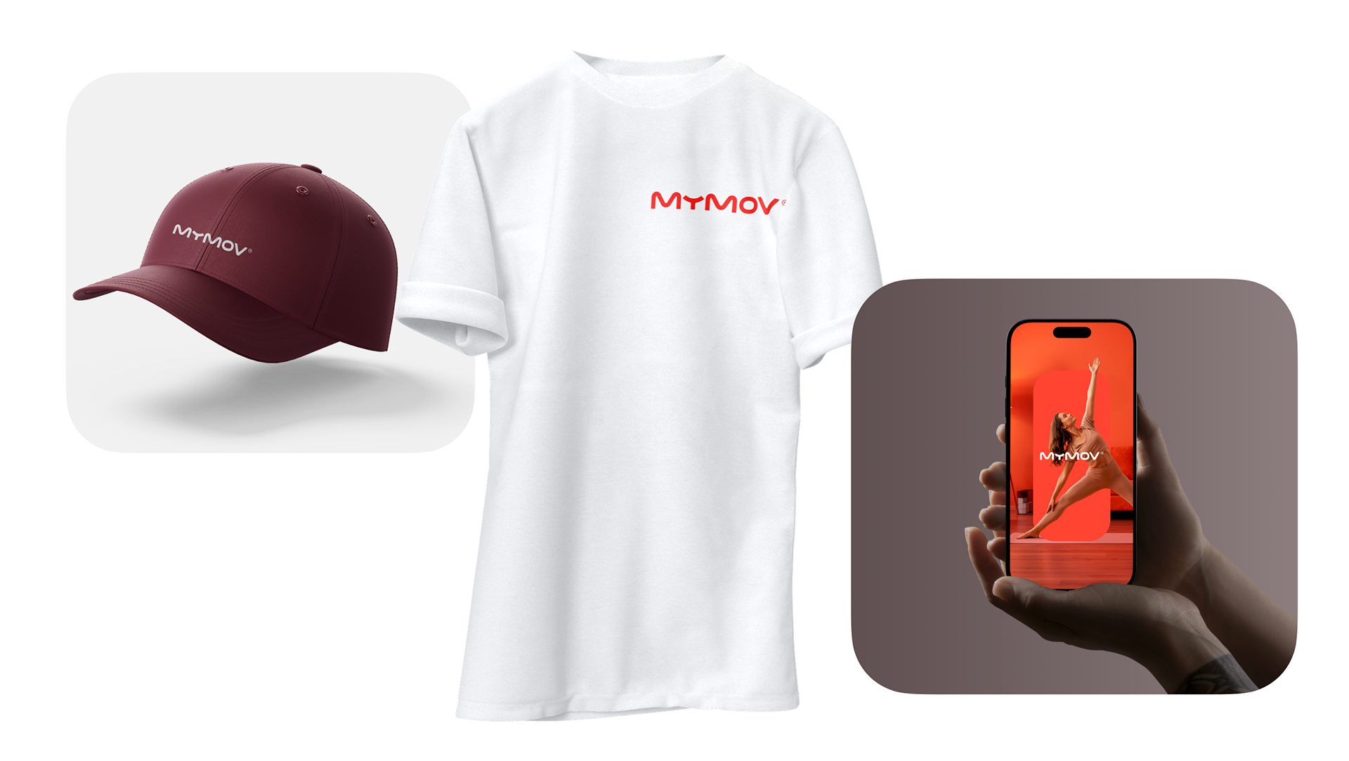
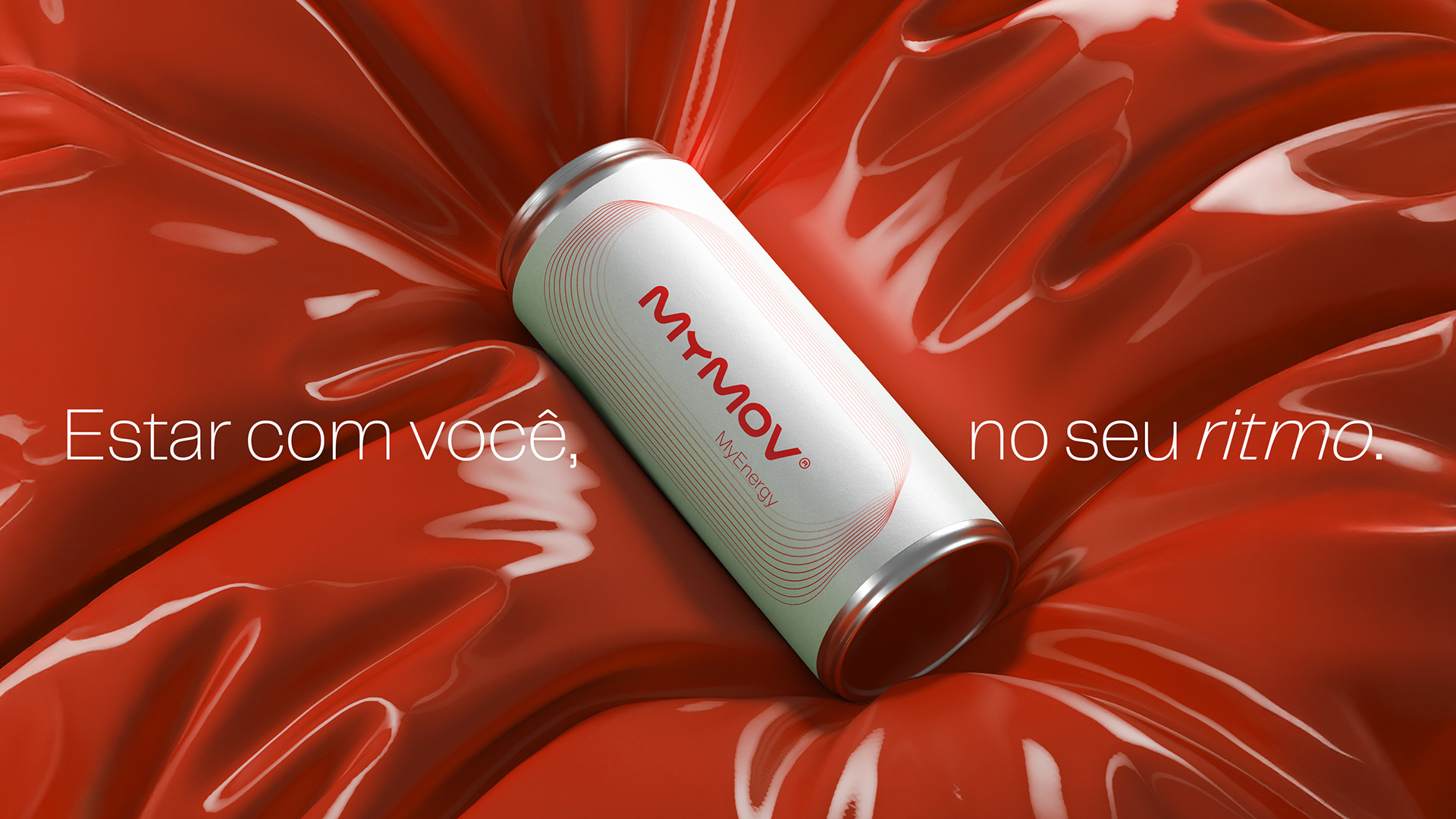
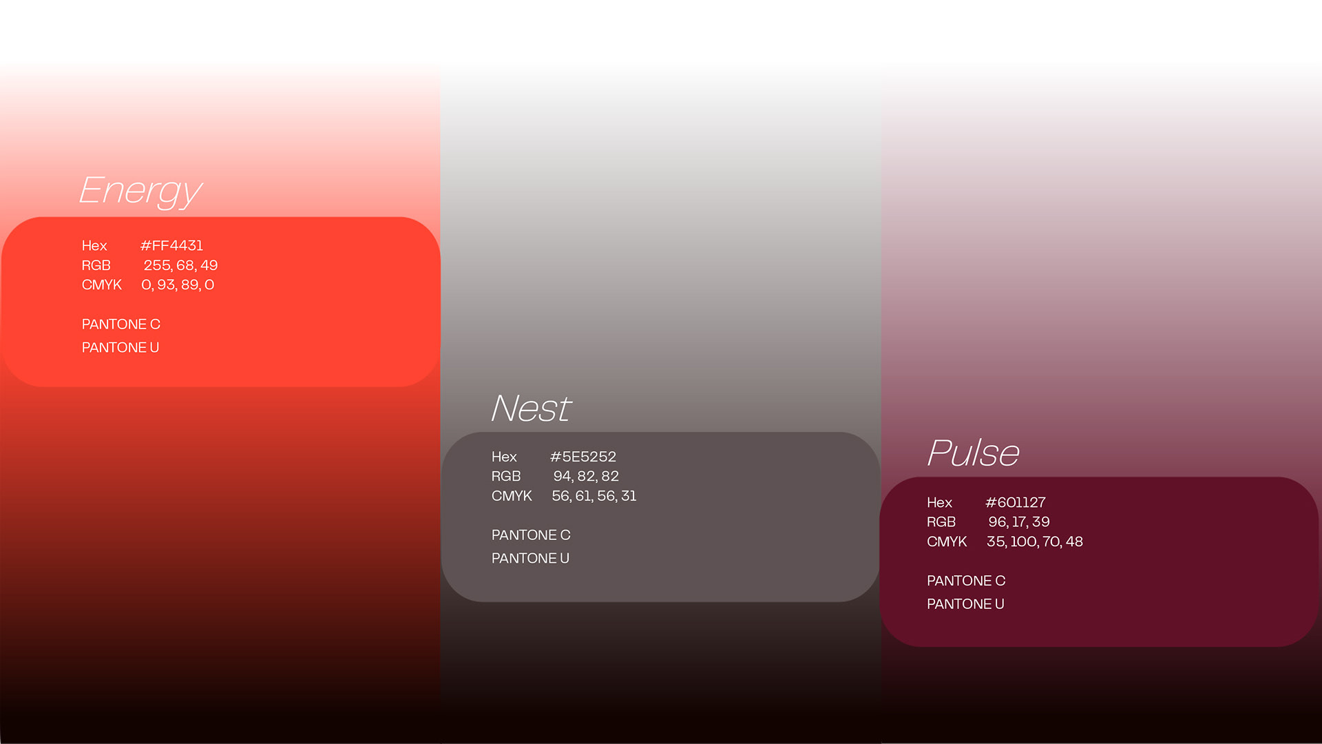
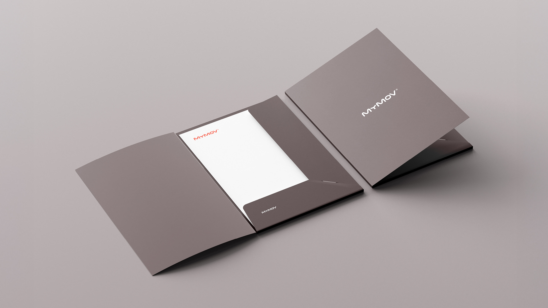
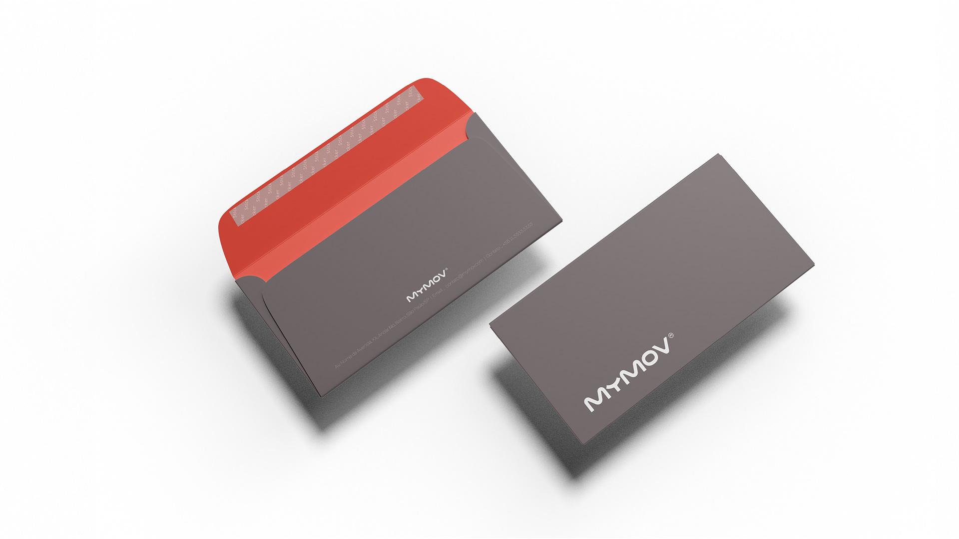
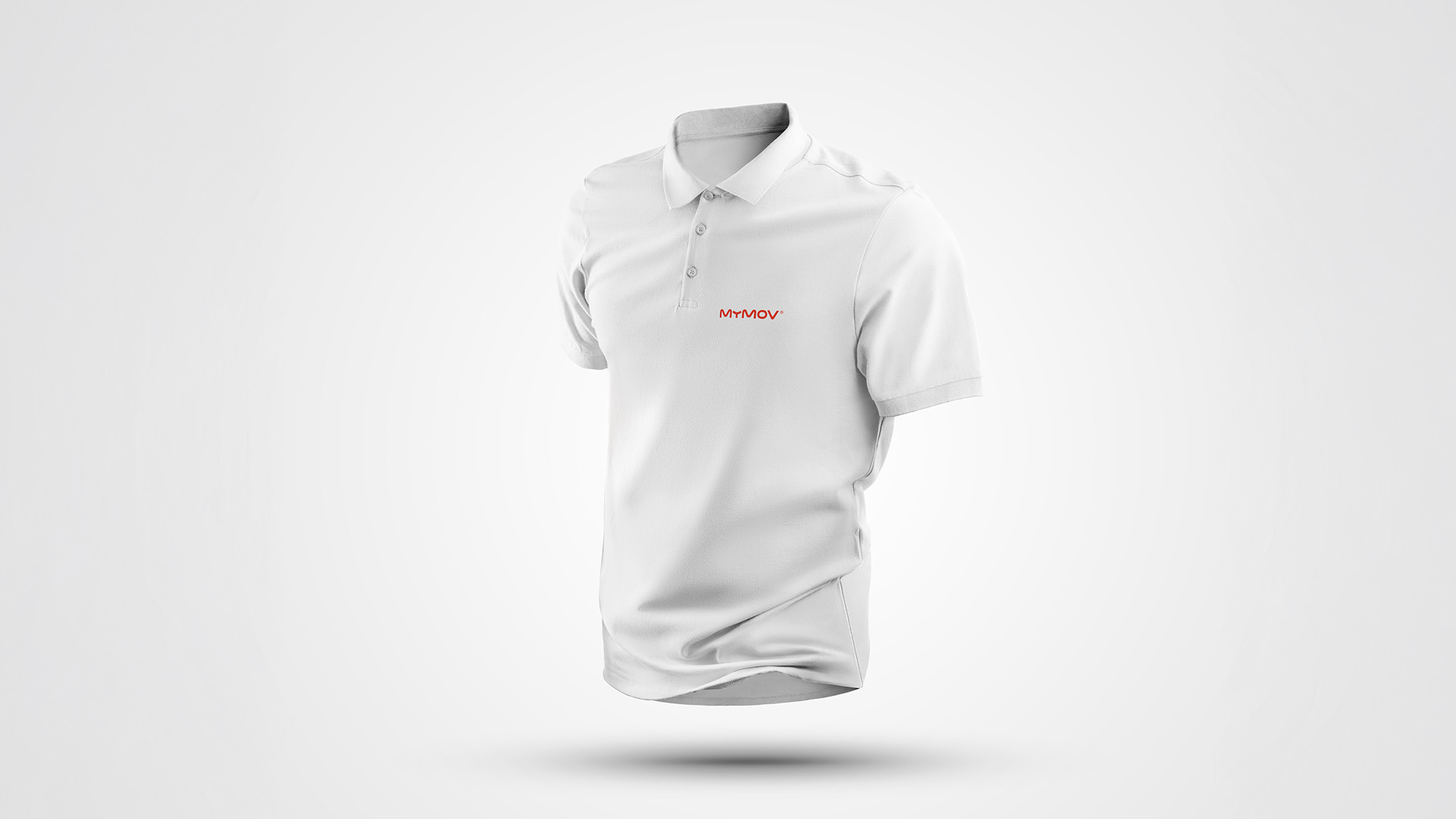
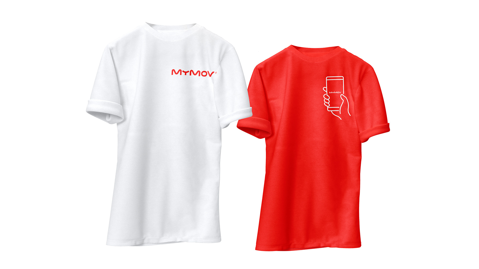
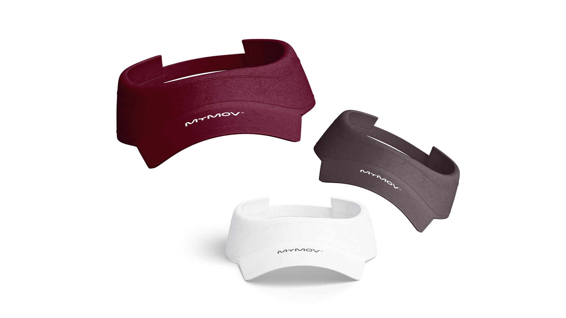
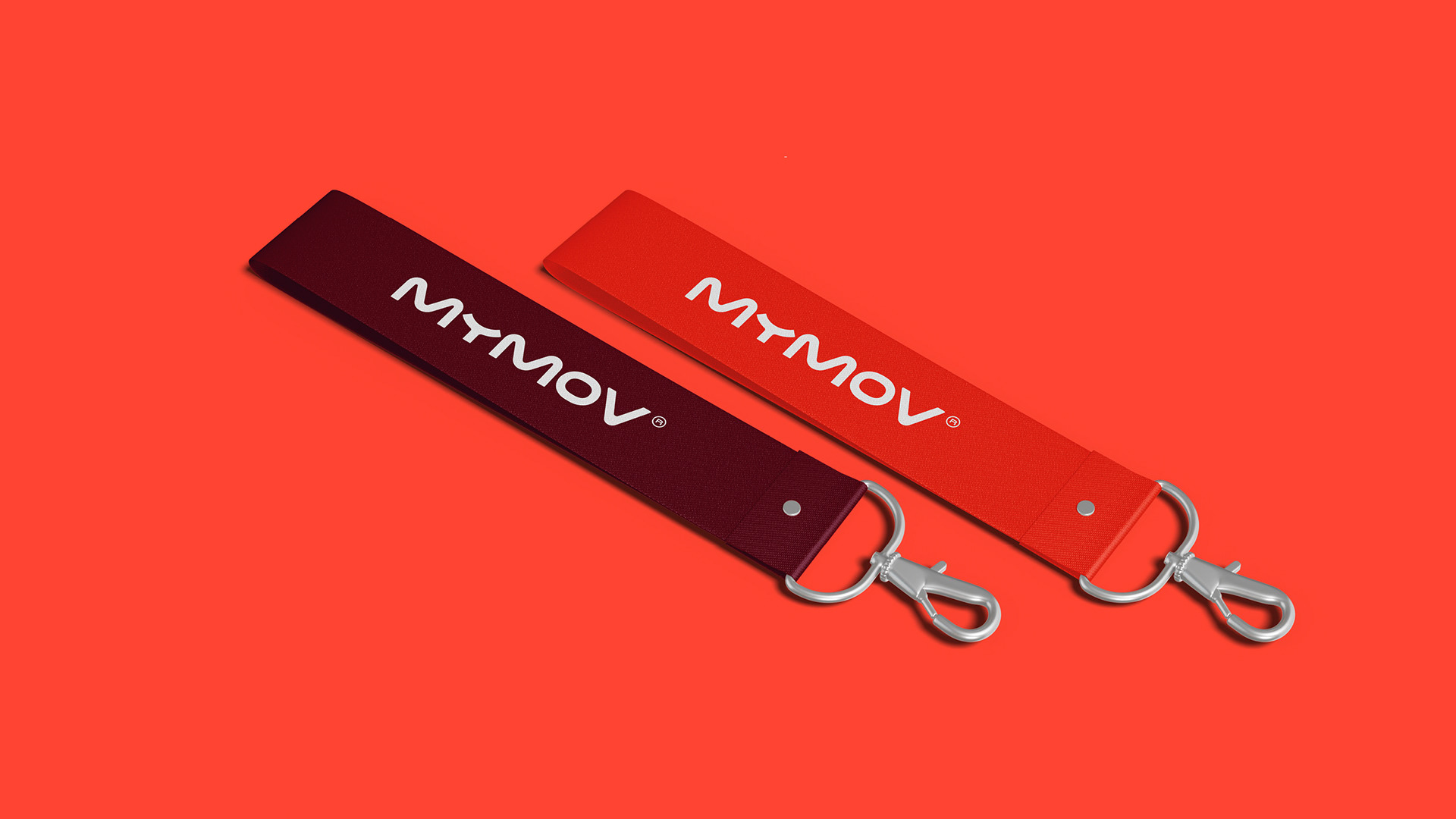
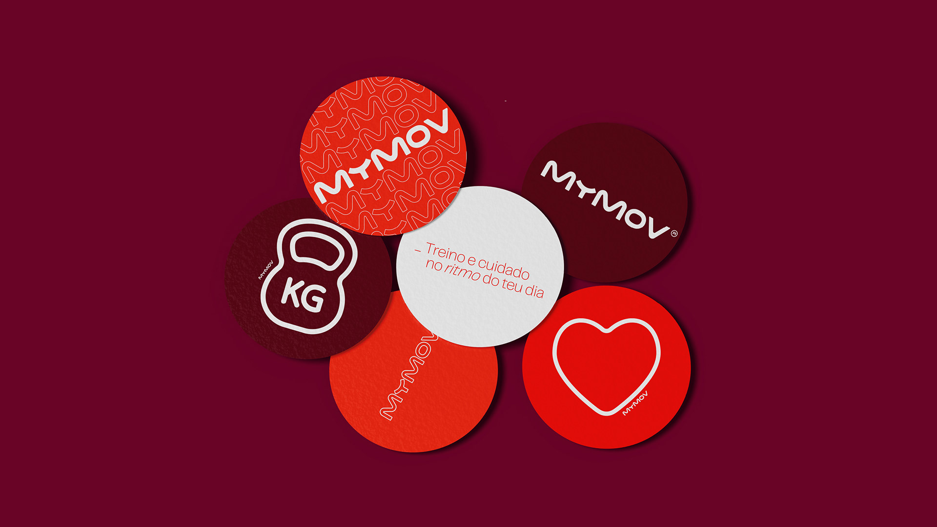
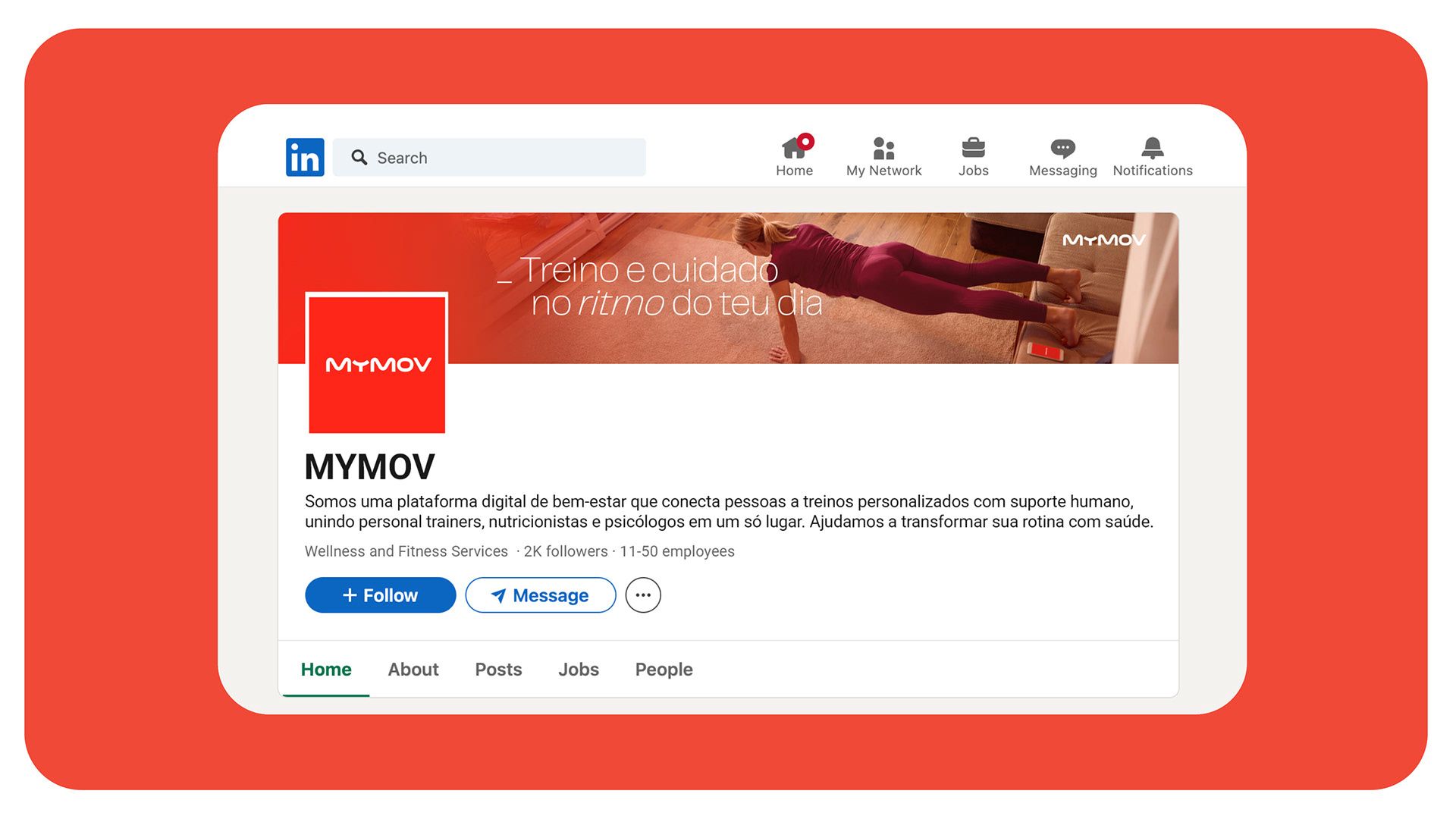
The colour palette is led by a vibrant red-orange, energetic enough to express movement and motivation, yet warm enough to feel human and approachable, balanced by soft neutrals and natural tones that bring calm, clarity and a sense of wellbeing.
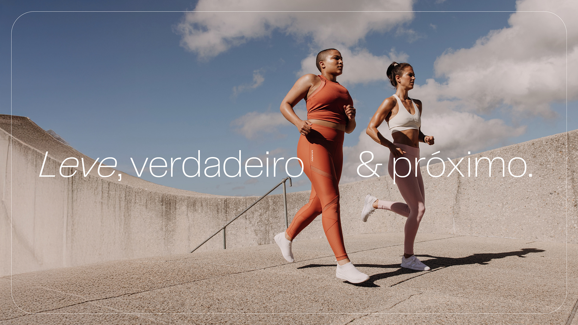
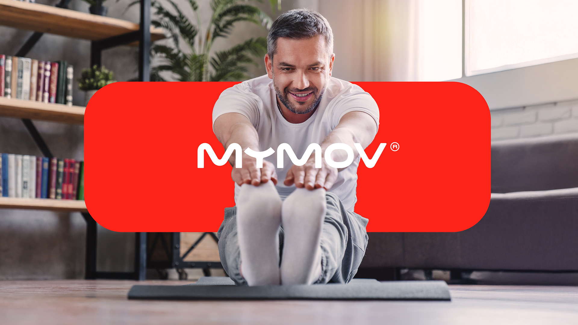
A vibrant yet approachable visual language reinforces the brand’s promise to be present without pressure, combining autonomy with support and technology with genuine human care. Because progress isn’t about keeping up with someone else, it’s about moving forward at your own rhythm.
SEE MORE.
Every letter of the MyMov wordmark was custom-drawn, giving the brand a distinctive and ownable character. Its fluid, elastic construction creates a continuous visual gesture that stretches, embraces and connects, representing movement, adaptability, human connection and evolution.
The colour palette is led by a vibrant red-orange, energetic enough to express movement and motivation, yet warm enough to feel human and approachable, balanced by soft neutrals and natural tones that bring calm, clarity and a sense of wellbeing.
A vibrant yet approachable visual language reinforces the brand’s promise to be present without pressure, combining autonomy with support and technology with genuine human care. Because progress isn’t about keeping up with someone else, it’s about moving forward at your own rhythm.
SEE MORE.